
Activity Feed › Discussion Forums › Strictly Surveying › A Day/Hour Planner Observation tool
A Day/Hour Planner Observation tool
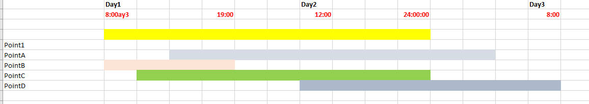
Posted by gisjoel on December 21, 2021 at 12:38 amThe best way to explain is to see the attached. TBC can’t do this as far as I can tell, display Time duration for Points, not vectors. Maybe this is in a package for planning a campaign, I actually am done with the campaign and want to graphically show the point by point overlap.
Is there a tool, Excel macro that someone uses to plan overlapping sessions. My table has points, Time Start, Time End, I just want to graphically show this.
 jitterboogie replied 2 years, 4 months ago 5 Members · 9 Replies
- 9 Replies


Question:
Why do you care more about the time and overlap of the points versus the vectors?
Genuinely asking, because I’m curious.
The overlap of the vectors is where the final point data is resolved to, and I’m guessing it is the physical location on the earth surface that you’re focusing on, is that what I’m understanding?

Thanks @jitterboogie,
In this case, this was an OPUS Share campaign. A multi-day effort to provide NGS priority marks to NGS for the GPS on Benchmarks. Although I will compare with sessions and resolve final point data, I’m trying to provide a graphic to the Park overlap of data collection by day/time. In TBC, the equivalent would be to select all the T02 files in the Imported folder, right click and create and pull out the satellite data from the satellite section in a graphical form. In mapping software, without vectors, this is a pretty mundane thing to produce. Less so in the surveying world with overlap of vectors is precedent.
I work in both realms, and in the end the final product consuming group drives the bus I suppose.
What version of TBC are you using?

There may be some campaign tool out there for planning (for all the NGS work I did we just planned it out using Excel), but for existing data TBC’s Time-Based View will show occupation overlaps:
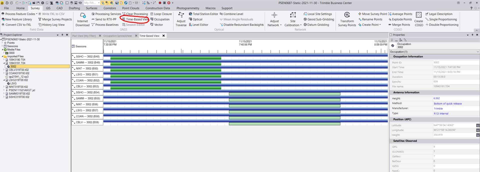
It’s not perfect, but it does give a decent visual. Depending on how much overlap and between how many points you want to show at the same time, it might not be what you are looking for.
“…people will come to love their oppression, to adore the technologies that undo their capacities to think.” -Neil Postman
Maybe a Gantt chart could be used for this. Here’s Microsoft “support” for a Gantt chart in Excel.
And here’s a commercial site:
Currently using TBC, v. 5.52
Yes, this particular product is focused on a Park’s managment team who after several years, allowed us to observe NGS marks along a main corridor and now its time to present results in a simple, non technical manner.
The Time based visual is, like you mention in my case, a very busy visual that doesn’t need to expose overlapping sessions but simply overlap in time on Point occupations. I think Excel will have to do in my case and one that is more inline with a campaign planning graphic.
Thanks. I’ll check out the chart template
 Posted by: @gisjoel
Currently using TBC, v. 5.52
I’ve heard, from a solid source, that TBC 5.6 has a licensing issue and is pretty buggy. Developers are aware but it may be best to hold off installing to keep from having possible issues.
T. Nelson – SAM, LLCI just upgraded to 5.60 again.
5.52 was buggier.
I’ll ping my trimble engineer buddy and see if he’s in the TBC group or some other bizzare esoteric group that doesn’t care about it to get some Intel.
It fixed my 5.40 gps leap second issue so I’m over the moon now.
And can’t use the software excuse I was seeing to not wrap up my little topo…dammit.

Log in to reply.